 machine.")
A Gadgetopia post I read the other day gave me the idea to investigate library website design of a decade ago using the Internet Archive’s Wayback Machine, in order try to get a sense of the way libraries presented information in the earliest days of the web. If you are not familiar with how it works, the Wayback Machine archives periodic snapshots of a given website, facilitating the ability to track web design and site changes over the life of its URL. Although the advanced search function of the Wayback Machine leaves something to be desired (no archived page natural language searching, only searchable by URL, super unstable links and clunky return timing), all of that is forgiven based on the valuable and endlessly entertaining service the Wayback Machine provides.
Trolling the depths of early library sites proves interesting, although largely predictable – I found that with little exception, after the idea of a library website materialized in 1996 or 1997 (as opposed to offering only an OPAC) and beyond the addition of dedicated email reference typically around 1999, the only aspects of our collective web presence that changed significantly were the programming and design techniques used to create them. Far and wide, libraries still use the same (albeit more sophisticated) descriptive language and conceptual hierarchies than they did in the late 90s – roughly, library information, search/discovery tools, library services, and special/digital collections.
Take a look at the one of the best/worst examples of a semi-coherent early library home page I was able to find, NYPL in January of 1997:

Ouch. I assume that the broken image likely was a picture of the downtown library, perhaps overlaid by a globe or dusty tome. Links are grouped by mysterious logic – a good example of the age-old struggle to anticipate how users want to access library information and materials online. To their credit, within a year NYPL had developed a much more sophisticated looking site, complete with rotating images and a clarified array of link choices:

Comparing these illustrates how rapidly libraries seemed to create a cohesive and increasingly standardized online presentation style, exemplified by the University of Michigan’s relatively excellent 1997 site, which includes the first example of a branded “Ask Us” email reference service I found and a modern toolbar navigation element at the bottom of the page:

Compare this with their 1996 site, which consisted entirely of one insanely cryptic message:

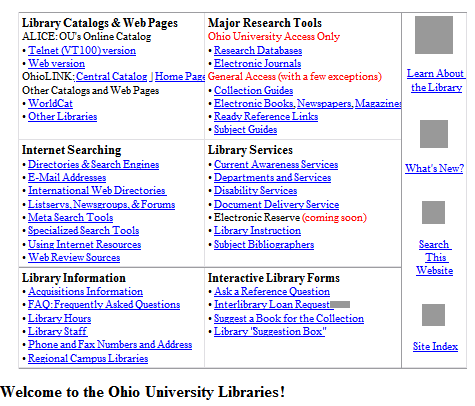
Although I think it is both well designed and functional today, my institution’s 1998 website is a perfect example of the still-common too-much-information issue on top-level pages:
Many early library sites seemed to put a strong emphasis on special collections, potentially because of the relative dearth of searchable database content – somewhat ironic based on the more recent stress on digitization and accessibility of unique holdings. I assume that a natural inclination of early library web developers was to focus as prominently on the scope of an organization as its services. That said, one finds plenty of evidence that, however hilarious they may be in terms of current design standards, one of the earliest motivators of library web design was clearly “user-centered” – to connect different types of patrons with different types of information.
If nothing else, using the Wayback Machine to track the development of a library’s site over time is an exercise well worth undertaking, particularly as the debate over their relative underuse and opacity continues.

Leave a comment